NASA Earth Observatory image by Jesse Allen, using OMI NO2 data provided courtesy of Lok Lamsal, Aura Project Science Office.
By Adam Voiland / NASA;
For more than a decade, scientists have observed “ship tracks” in natural-color satellite imagery of the ocean. These bright, linear trails amidst the cloud layers are created by particles and gases from ships. They are a visible manifestation of pollution from ship exhaust, and scientists can now see that ships have a more subtle, almost invisible, signature as well.
Data from the Dutch and Finnish-built Ozone Monitoring Instrument (OMI) on NASA’s Aura satellite show long tracks of elevated nitrogen dioxide (NO2) levels along certain shipping routes. NO2, is among a group of highly-reactive oxides of nitrogen, known as NOx, that can lead to the production of fine particles and ozone that damage the human cardiovascular and respiratory systems. Combustion engines, such as those that propel ships and motor vehicles, are a major source of NO2 pollution.
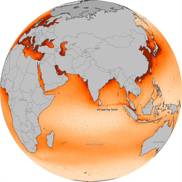
The map above is based on OMI measurements acquired between 2005 and 2012. The NO2 signal is most prominent in an Indian Ocean shipping lane between Sri Lanka and Singapore, appearing as a distinct orange line against (lighter) background levels of NO2. Other shipping lanes that run through the Gulf of Aden, the Red Sea, and the Mediterranean Sea also show elevated NO2 levels, as do routes from Singapore to points in China. These aren’t the only busy shipping lanes in the world, but they are the most apparent because ship traffic is concentrated along narrow, well-established lanes.
The Atlantic and Pacific Oceans also have heavy ship traffic, but OMI doesn’t pick up NO2 pollution tracks because the shipping routes are less consistent. The shapes of landmasses force ships into narrow paths in the Indian Ocean, while ships in the Atlantic and Pacific tend to spread out over a broad areas as they navigate around storms.
In addition, the air over the northeastern Indian Ocean is relatively pristine. Heavy NO2 pollution (dark red in the map) from cities and off-shore drilling activity along the coasts of China, Europe, and the United States obscures the ship tracks that might otherwise be visible to OMI. In the map, the Arctic is gray because the lack of light during the winter and frequent cloudiness during the summer prevented OMI from collecting usable data in the area.
Urban areas and industrialization aren’t the only source of NO2 in the map. Agricultural burning in southern Africa and persistent westerly winds make an elevated band of NO2 that stretches from southern Africa to Australia. (In central Africa, easterly winds push pollutants from fires toward the Atlantic, keeping NO2 levels comparatively low over the northern Indian Ocean.) Lightning, which produces NOx, also contributes to background NO2 levels.
Just how much shipping contributes to overall NOx emissions remains an open question for scientists. Research suggests that shipping accounts for 15 to 30 percent of global NOx emissions; scientists are using satellite observations to reduce the uncertainty in such estimates.
OMI is not the only satellite instrument observing NO2 levels in the atmosphere. The Global Ozone Monitoring Experiment (GOME) instruments on the European Space Agency’s ERS-2 and MetOp-A satellites, as well as the SCIAMACHY instrument on the Envisat satellite, have made similar measurements. In 2012, Dutch scientists published a study combining data from all four instruments to show that the NO2 signal over major shipping increased steadily between 2003 and 2008, then dropped sharply due to the global recession and reduction in ship traffic.

“Sea of Lost Souls.” Photo source: ©© Aristocrat-hat


